If everything in a room was competing to be the main feature, you wouldn’t know what look at. In a room with a balanced colour scheme, the stars of the show are more obvious. It’s also important the colours themselves balance and complement each other. If, for example, you have an artwork that consists mainly of warm reds and oranges, then using blues and greens in scatters and decorative accessories will provide visual interest as they are opposing colours on the colour wheel. If you prefer a less contrasting look, you could choose colours that sit next to red and orange on the colour wheel, such as yellows and violets. So if you are looking for some inspiration to spruce up your place or space for your short term accommodation requirements, read on.
Where should I begin?
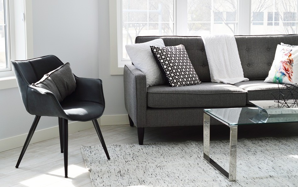
Start by choosing the colour of the largest piece of furniture. For a sitting room, this would generally be the sofa or modular. Next, choose the colour of the rug and occasional chairs. Last, choose the colours of smaller accent pieces, such as scatter cushions. If you’re looking to add personality and a touch of fun to your scheme, the smaller pieces are where to do it. They are easy and relatively inexpensive to swap out as tastes and trends change. Navy and grey with touches of gold create a smart, contemporary scheme. Navy with white or ivory gives you a Hamptons or coastal look. Introducing coral or raspberry to a navy-based scheme can add a touch of fun.
Naturals look great together and can be used in all sorts of settings. In a country setting, natural timber and rattan look relaxed and cosy. In a contemporary apartment, combining neutrals with brushed metal finishes and marble gives you a slick, sophisticated look. Tan leather is a classic go-to addition to most colour schemes, adding warmth and texture.
What is the 60:30:10 decorating rule?
It’s a timeless decorating principle that can help you create a balanced colour scheme. This guideline can be adapted in many ways. The 60 per cent could relate to wall and curtain colour; the 30 per cent could be the sofa; and the 10 per cent could be the scatter cushions. Or the 60 per cent could be sofa and carpet colour with the 30 per cent a feature wall colour. And the percentages don’t just apply to fabrics and paint colours – they can apply to timber and stone finishes too. The possibilities are endless.
Where does pattern feature in the 60:30:10 principle?
This really depends on the look you’re trying to create. If your sofa is fairly plain, you could add some pattern on a pair of occasional chairs. Or for a subtler look, you could add pattern on the scatter cushions. For a classic American look, you could add two or more patterns; a gorgeous plaid or check on occasional chairs with some paisley scatter cushions.
For a more dramatic look, you could use pattern for the 60 per cent proportion. A patterned wallpaper in a dining room would look incredible. The timber of a dining table would make up the 30 per cent and the fabric on the dining chairs the remaining 10 per cent.
Leave a Reply
You must be logged in to post a comment.